Reshaping a Website Through Navigation
While we rebuilt the CSI website from the ground up, one of the most impactful changes came from focusing on a single, often-overlooked detail: the navigation. It sounds simple, but changing how people move through the site reshaped the entire experience. And the results backed it up. Navigation usage nearly doubled, and navigation-driven conversions increased by 177 percent.
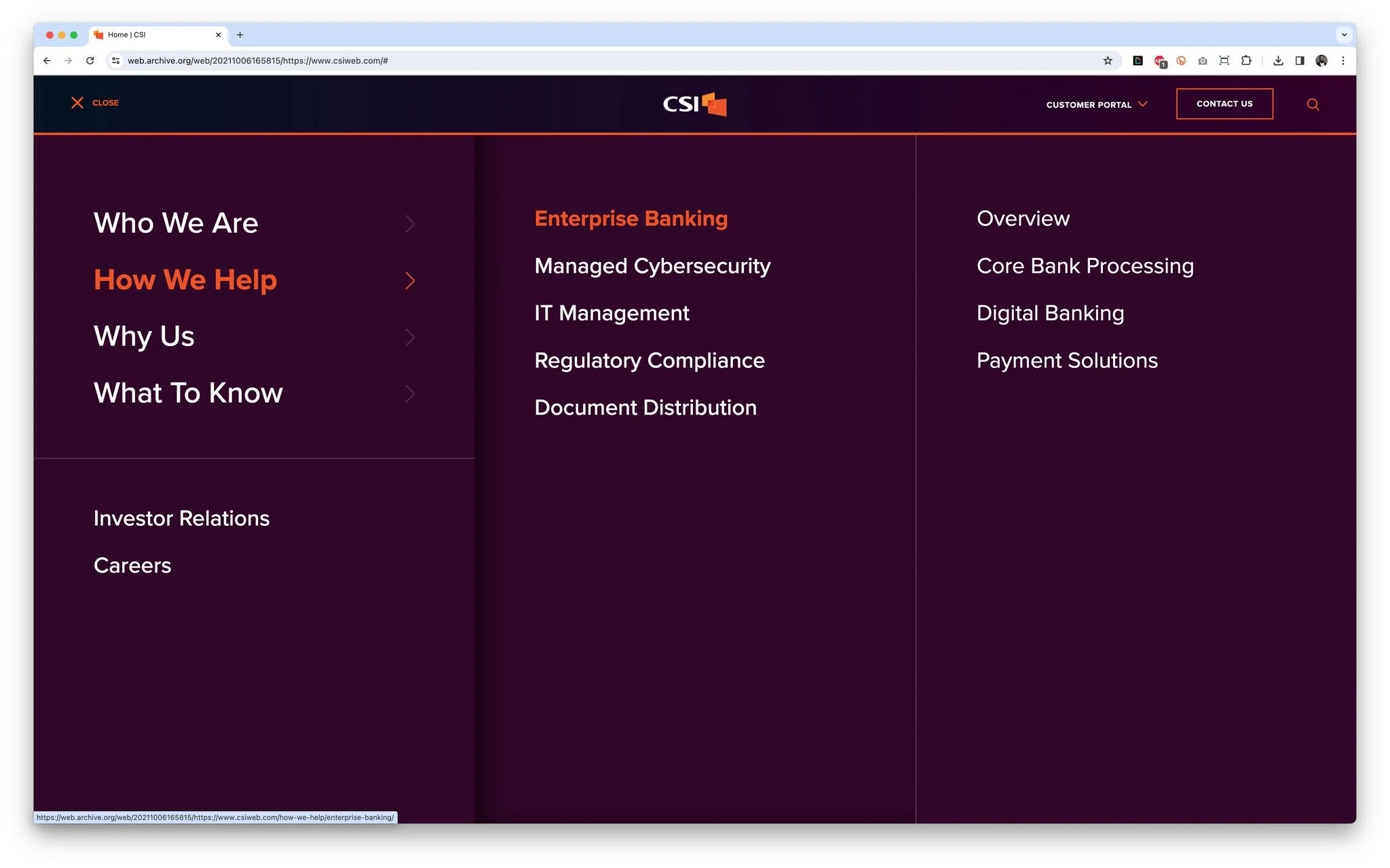
Our old navigation
Letting the Data Lead
We started by digging into the data. Users who interacted with the navigation bounced far less and were much more likely to move through deeper journeys on the site. That made the problem pretty clear. Only 7.24 percent of users were using the navigation at all, and just 0.67 percent of those users were converting. If navigation was clearly a positive signal, the real question became how to get more people to use it and how to make it actually work for them once they did.
The challenge wasn’t just visual design. Over time, the navigation had slowly turned into a reflection of internal requests instead of user needs. Product wanted certain solutions more visible. Product marketing needed flexibility for launches. Communications had announcements to highlight. Add years of growth to the mix, and suddenly you have a lot of pages competing for attention. Balancing those needs while still creating a clear, intuitive experience is always tough, but navigation can’t be built around internal structure. It has to make sense to the person on the other side of the screen.
A Different Approach
We also had to account for how people actually use the site across devices, screen sizes, and input types. The previous navigation leaned heavily on a mobile-first hamburger menu with sliding drawers and hover-based interactions. While it looked interesting, it hid content, didn’t translate well across devices, and gave users no clear path to take action within the navigation itself.
The new navigation took a more straightforward approach. We moved to a visible, always-on menu with clear, conversational labels, stronger hierarchy, and more breathing room. We introduced promoted content and a secondary sub-navigation for high-priority links, and we built conversion opportunities directly into the navigation to reduce friction and guide next steps.
After launch, navigation usage increased from 7.24 percent to 14.2 percent, and navigation user conversion climbed from 0.67 percent to 1.86 percent. It was a strong reminder that good design isn’t just about how something looks. It’s about how it works, how it guides behavior, and how it supports real outcomes.
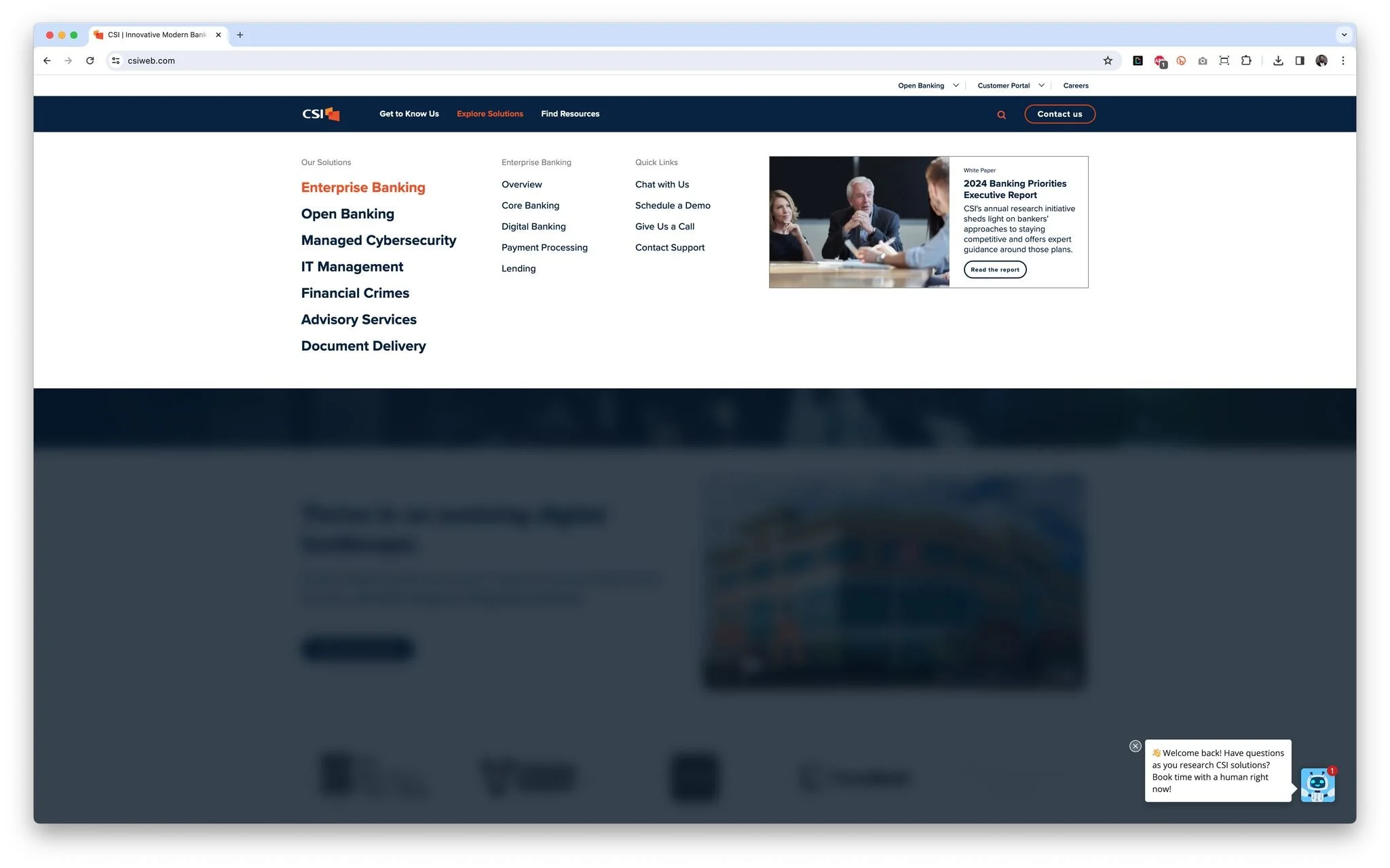
Our new navigation
Measured Impact
Navigation usage increased from 7.24% to 14.2%
Navigation-driven conversion rate increased 177%
Lower bounce rates among users who engaged with navigation
Clearer paths to key content and conversion points