How We Modernized the Visual Identity Without Starting Over
The CSI rebrand started with a deceptively simple prompt: “change the logo without changing the logo.” Easy, right? In reality, it was a careful balancing act. We were modernizing a nearly 60-year-old brand while protecting the trust and recognition our customers had built over decades. The goal was to create a visual identity and messaging framework that felt more confident, more current, and easier to use, without signaling disruption to a company known for stability and long-term partnerships.
The Process
We kicked things off by setting three clear goals: modernization, stronger brand recognition, and improved usability. From there, we took a hard look at what already existed. What was working? What wasn’t? And what could we improve without triggering a massive (and expensive) ripple effect?
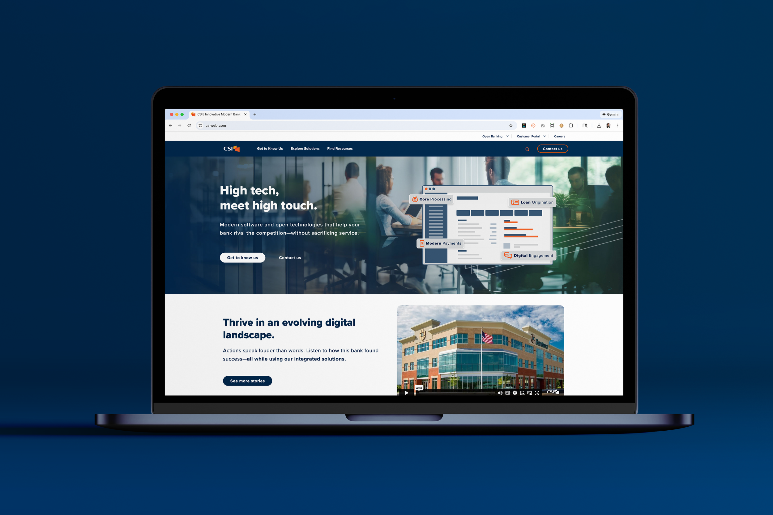
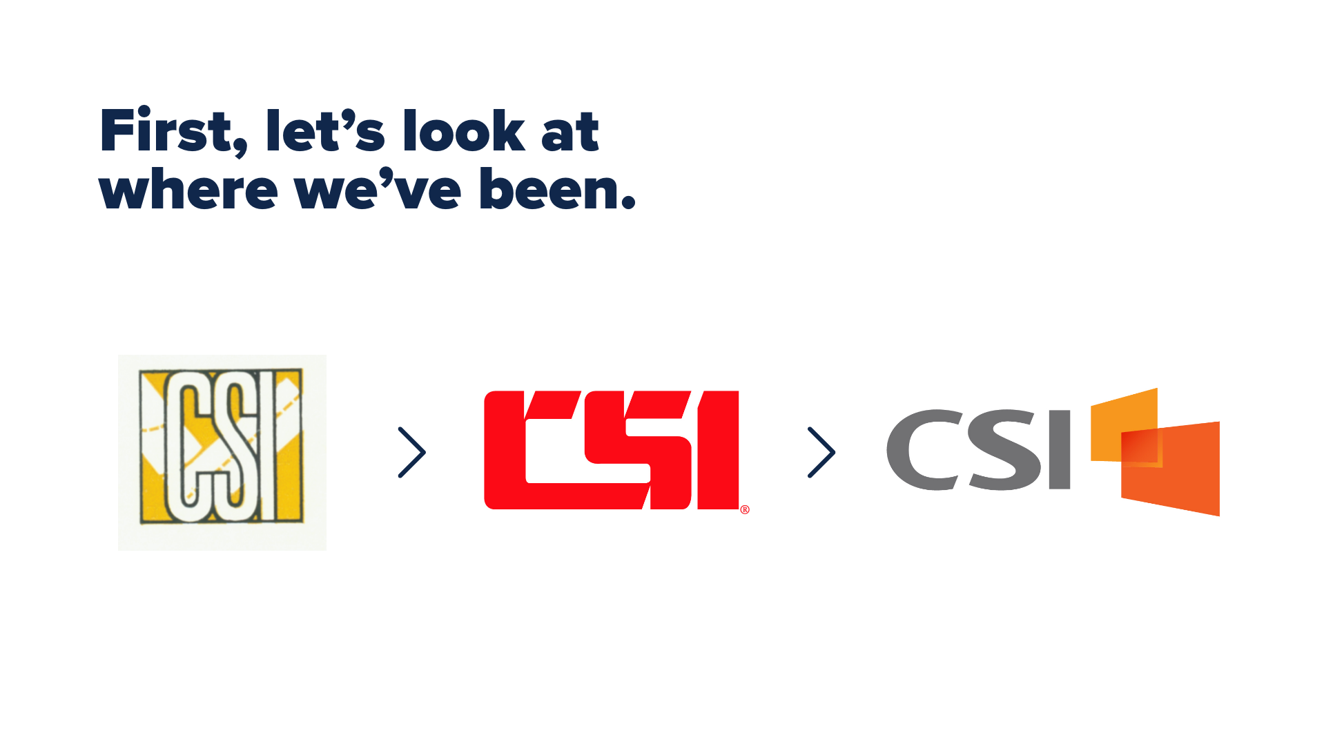
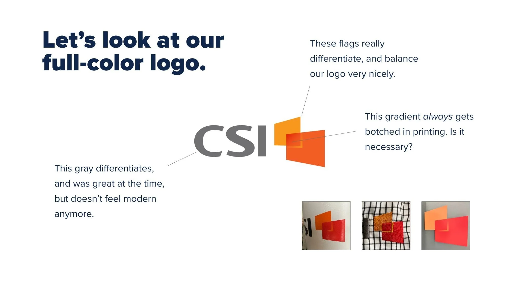
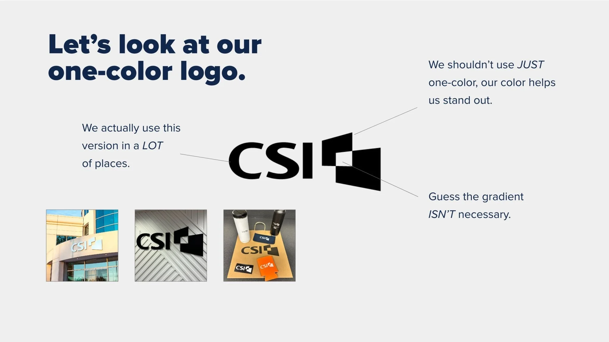
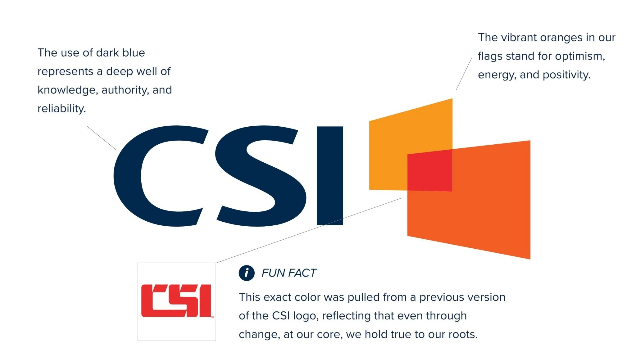
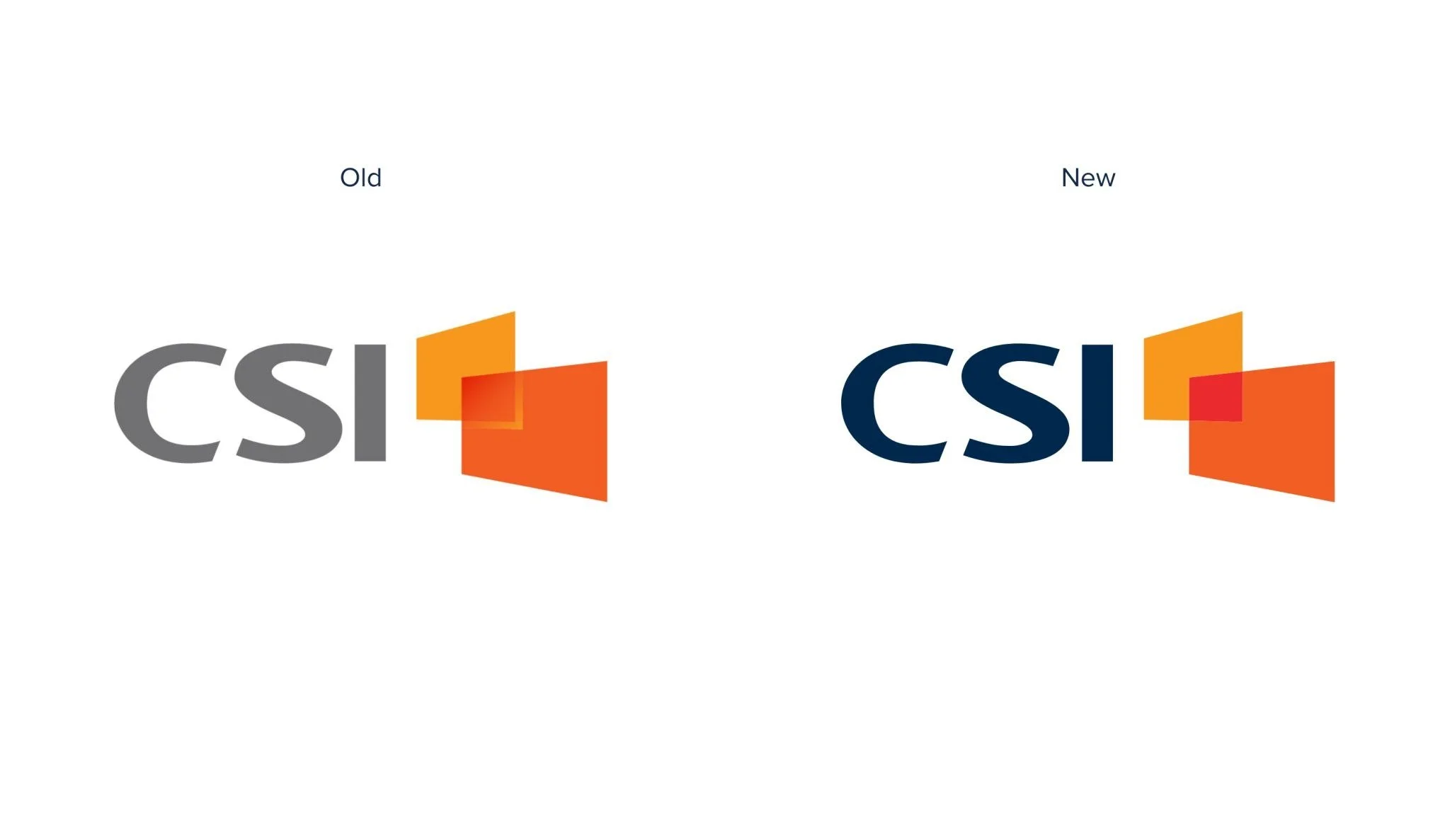
The final solution wasn’t a dramatic overhaul. It was a smarter system. The full-color logo became bolder, brighter, and more modern, instantly improving clarity and digital performance. At the same time, the one-color logo stayed intact, which allowed us to be responsible with budget while still making a meaningful change. We even tucked in a subtle throwback to a previous version of the logo, a quiet way of honoring the brand’s history instead of wiping the slate clean.

Equipping the Masses
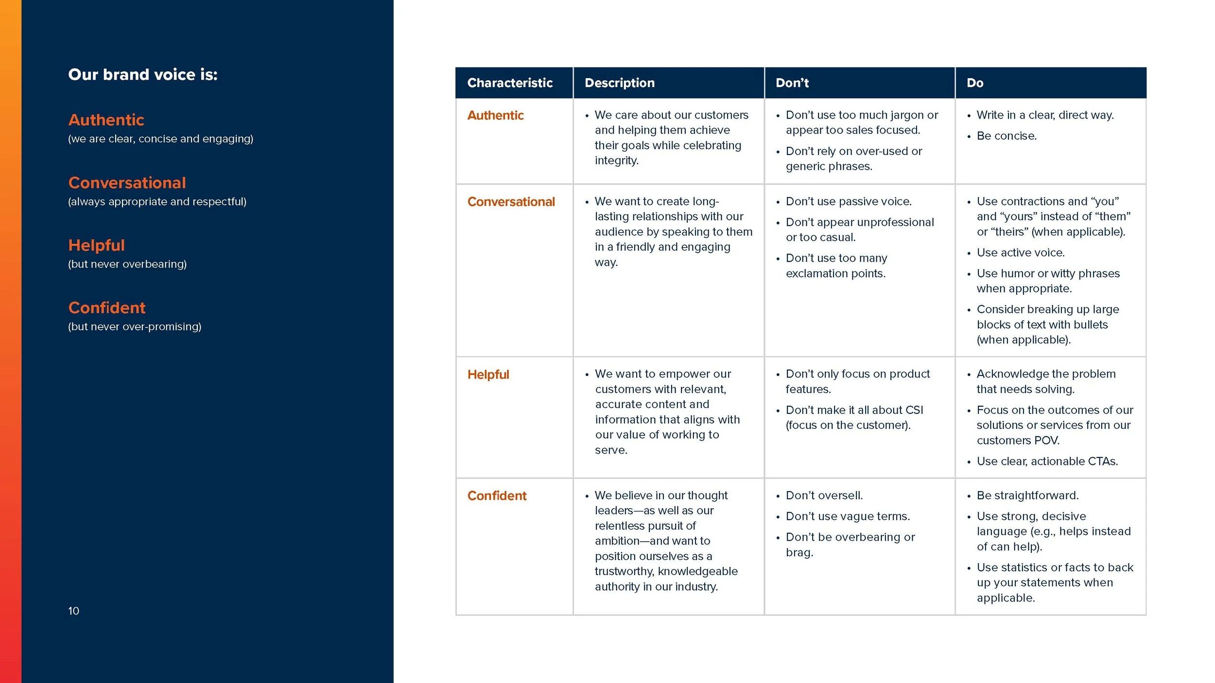
Of course, a brand refresh only works if people can actually use it. So a big part of this effort was making the brand accessible across the entire organization. We built a centralized brand toolbox that gives teams easy access to the resources they need to show up consistently and confidently. That included corporate PowerPoint templates, a custom-built email signature generator, social graphics, brand guidelines, and a growing library of self-service assets.
By removing friction and reducing off-brand guesswork, teams could move faster and stay aligned without having to ask for help every time they needed a slide or a graphic.
This rebrand was a true labor of love and a deeply collaborative effort. The result is a brand that still feels unmistakably CSI, just sharper, more intentional, and better set up for whatever comes next.
Measured Impact
Company-wide brand refresh rolled out without a full logo replacement
10+ self-service brand tools created for teams across the org
Reduced ad-hoc brand requests and off-brand usage
Enabled faster execution across campaigns, events, and content